Canada’s vaccine rollout got off to a disappointing start, with country after country surpassing Canada in the per capita number of doses that have been administered, despite what seemed like a head start for us.
I first created this bar chart race back in late February. Starting at the beginning of April Canada kicked its vaccine rollout into higher gear. Not top gear, mind you, but we’re no longer the laggard we were.
The chart shows the number of vaccinations administered for every 100 people across a wide array of countries. The figures come from the indispensable Our World In Data project.
More updates will follow as the rollout continues.
When an oil market war broke out between Russia and Saudi Arabia on March 8, it triggered the worst single-day price collapse since the early 1990s. As petroleum-producing nations, including Canada, have grappled with the fallout the price plunge has drawn comparisons to the oil routs that occurred in 2008, during the Great Financial Crisis, and in 2014 when markets finally caught up with America’s shale boom.
It’s tempting to view all three downturns as separate episodes, but everything that’s happened since 2008 has been the back end of a boom that more or less began in 1998. That was when oil prices finally bottomed out after crashing in 1980 and begun their epic climb.
I created the following chart a few years ago for a story for Maclean’s, and I’ve kept updating it since. (I’ll continue to do so on this page.)
It tracks what happened after that 1980 oil bust, overlaid with the price of crude since the 2008 peak, all adjusted for inflation.
(Updated April 20)
This is by no means a forecast, but it does provide some perspective on what we’re seeing now. As painful as this latest bout of low prices is for Canada’s oil producing regions—which layers on top of the economic trauma wrought by the Covid-19 shutdown—the path oil took after the 1980s bust shows further declines in the future would not be unprecedented. If this downturn lasts as long as the rout after 1980, that would entail another seven years of slumping prices. Even if OPEC and Russia reach a truce, there is little on the horizon to suggest an impending reversal.
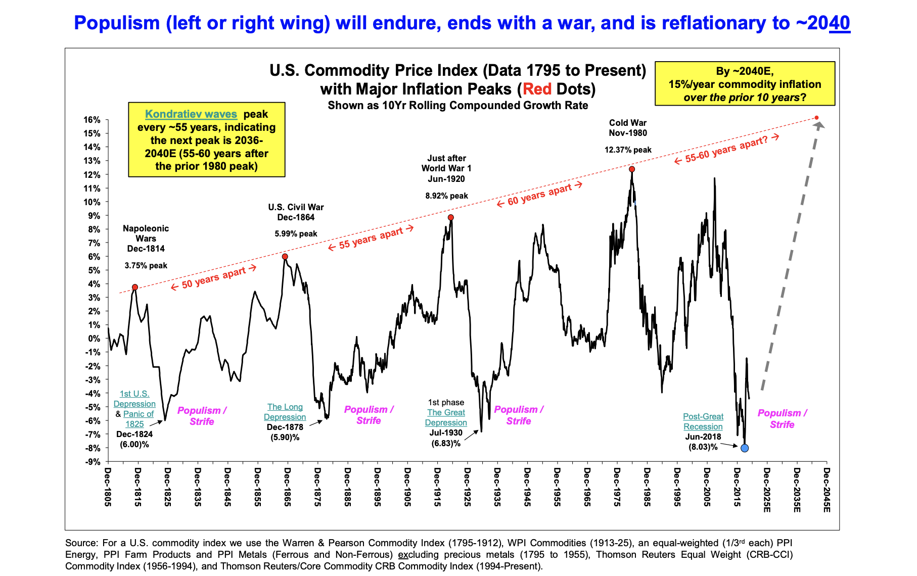
Having said that, it would also be unprecedented if the price of oil doesn’t eventually rise again. The chart below comes from a December outlook report by Stifel, a U.S. investment bank, and it tracks the long term growth rate of inflation-adjusted commodities since 1795. The boom and bust cycle that every commodity producing nation is familiar with is on display. As is the long-run cycle of populism, strife and conflict. With the emergency break pulled on the economy and a global recession of unknown depth and duration now unfolding, there’s little reason not to expect an era of domestic and international tension will follow.
Before I found my way into journalism, I wanted to be a cartoonist. Heck, before I wanted to be an astronaut I wanted to be a cartoonist. It didn’t work out, but from time to time I still like to dabble. I’ll make this post my ongoing repository for my econo-doodles and will try to dig up some old ones from the past.
“FOMOing over real estate was more fun” – March 2020
“Coronas, Iris” – March 11, 2020
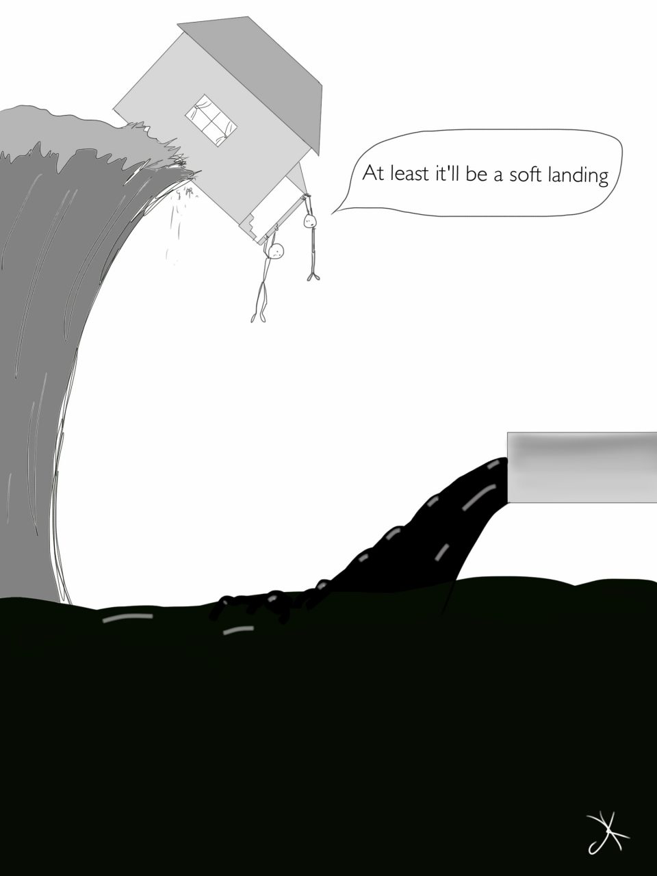
“Soft landing” – January, 2016
Update March 2020: This one from the initial crash in oil prices four years ago now seems suddenly relevant again to the Canadian economy.
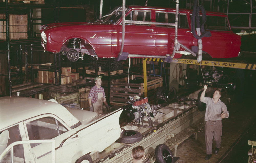
What auto manufacturing in Canada looked like in 1961 when it took 30 workers to produce $1 million of output. Today it takes eight. (Library Archives Canada)
At 2 pm on Dec. 18 the last truck rolled off the line at the General Motors assembly plant in Oshawa. The closure means the loss of 2,300 jobs. A clutch of 300 workers will stay on at the plant stamping panels and doors, and the site is being converted for testing autonomous vehicles.
The demise of the assembly plant caps a long, dark decade for manufacturing in Canada. Will the 2020s be better?
Well, if the trend holds the coming year will see the industry finally recover to its pre-Great Recession high of 15 years ago. But that’s only when measured by GDP. In terms of manufacturing jobs it would be nice just to see employment recover to the level it was at before the recession in 1974.
The reality is output from factories and the number of workers in those factories have been moving in different directions for decades. That’s because technology has enabled manufacturers to do much more with fewer people.
The chart below puts that in focus. In 1961, it took 30 workers to produce $1 million of manufacturing output in Canada. Today, that same level of factory activity can be achieved with just eight workers.
The inspiration for the chart came from this 2016 Brookings piece explaining why Donald Trump’s promise to bring factories back to U.S. shores wouldn’t result in a resurgence of factory jobs, which it hasn’t.
But as the above chart shows, something is obviously missing from this post-recession period that’s exacerbated the jobs-output disconnect. Even if the long run trend in manufacturing jobs has been more or less flat for 50 years, there were still job gains during periods when output was expanding and new highs were reached. Not this time.
From 2004, when manufacturing employment peaked, to 2009 when the 2008/09 recession ended and the recovery began, factories shed 610,000 jobs, Statcan’s monthly employment data show. Since then not a single net new manufacturing job has been created for Canada as a whole. Quite the opposite — in November there were 41,000 fewer manufacturing jobs than in November 2009.
One critical ingredient has been missing over this time: private investment in things like machinery and equipment, and intellectual property products. Here’s the same chart, only now with private investment in manufacturing overlaid.
Whereas private investment once led the sector higher, over the past two decades stagnant or falling levels of investment have acted as an anchor weighing it down. As much as technology has allowed manufacturers to get by with fewer workers, underinvestment in capital, machinery and equipment is taking its toll in the form of lower productivity and that’s restraining the ability of manufacturers to expand production capacity. And so you end up with anemic growth in output and no new jobs.
Can these trends be reversed? There have been signs of a pick-up in business investment. In the third quarter capital spending rose at the fastest quarter-over-quarter pace since 2017, but it’s unclear how long that will be maintained. And while it’s true that low-cost competition from other countries means a huge number of those manufacturing jobs lost since the early 2000s are never coming back, without significant investment Canada’s manufacturing output is almost certain to remain feeble and job growth nonexistent in the decade to come.
Greetings. It’s been a long time since I’ve had a blog of my own. I plan to use this space as a repository for my random thoughts on the Canadian economy, business scene and politics. Oh, and it’s a safe bet there’ll be charts. Lots of charts. I make no promises about the frequency of my posts, but I’ll try to develop a rhythm before too long. In the meantime, follow me on Twitter or drop me an e-mail.